Branding for a holistic therapy practice that draws from the natural cycles of life as both metaphor and guide for moving through life’s ups and downs.
Challenge: Re-Crearse came to us with a clear, heartfelt vision: a therapy practice rooted in nature’s cycles — encouraging reflection, release, and rebirth. But while the concept was powerful, the visual identity didn’t yet reflect that depth or intention.
Our solution? Turn that internal clarity into a cohesive brand that feels grounded, intuitive, and calming — while still standing out in the clinical wellness space.
(1) Creative Direction
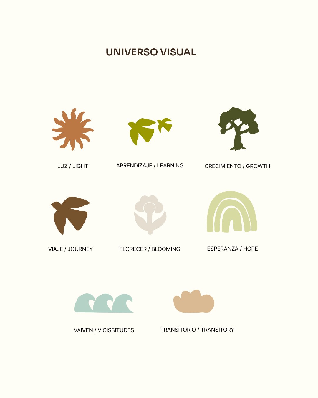
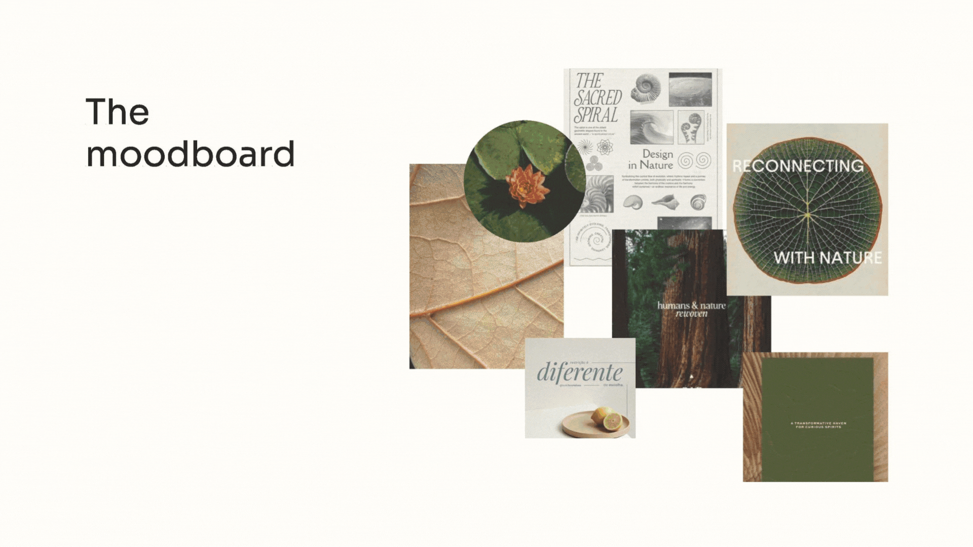
Leaning into organic textures and subtle symbolism, the overall direction was meant to feel nurturing, introspective, and rooted in nature’s rhythm.

(2) Logo Suite
The logo was created to reflect approachability, openness, and the path of continual growth. "Re-crearse" literally means "to re-create oneself."
Rounded corners, a clean serif typeface, and a spiral interwoven, reflect how growth and self-discovery are intrinsically related.


(4) Brand Guidelines
We built a set of brand guidelines to help the founder stay consistent — outlining everything from logo usage to type hierarchy and tone direction. Even if the brand grows into a larger practice, the system will scale with it.